Onboarding Institutional Accounts at Bullish.com
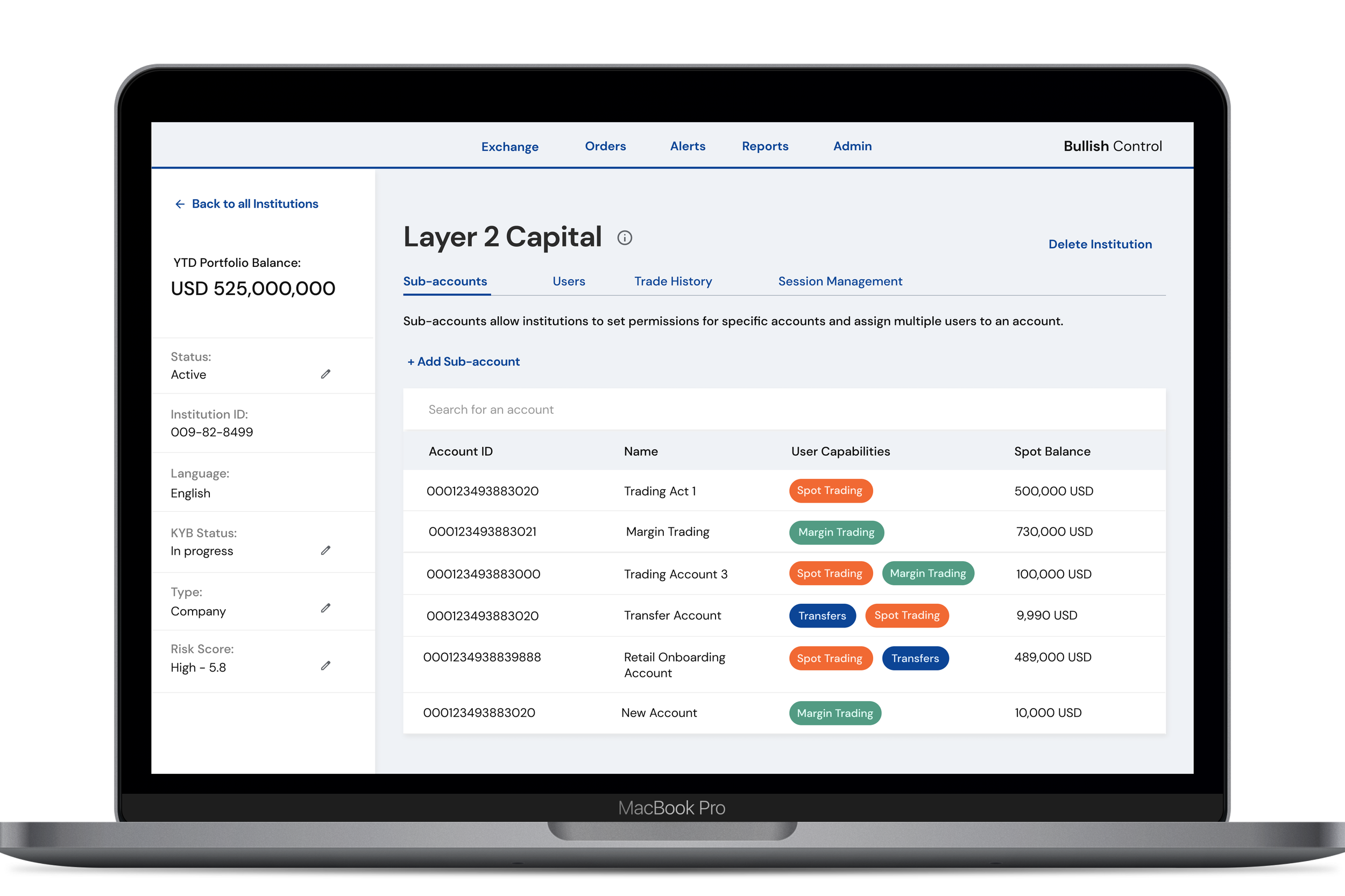
Bullish develops financial services for the digital assets sector. Similar to a typical intranet, employees use Control to view, track, and update details about customer’s portfolios, accounts, and trades. This feature enables the sales team to quickly bulk add and delete multiple users to an institution/enterprise.
Areas of Expertise: User Research / Workshops and Strategy / UI and UX Design
Problem
Employees can only create accounts for a single user, one at a time. There’s an influx of new diverse accounts with multiple users and the sales team needs to create and view customer accounts quickly and effectively.
Discovery
First, I set up remote brainstorm sessions with the lead Product Manager. I initially began these conversations by asking open-ended questions to help me uncover what information I need, what information the PM could provide me with and who else I need to reach out to. I especially focused these conversations around the users who would be impacted by this feature.
How are we currently supporting institutions during the account creation and onboarding process?
Are we primarily speaking to multiple individuals? What digital tools are we using to do so?
What vision does the business have for investing into Control?
Defining Users
Relationship Manager, a Bullish employee who is responsible for the customer’s account information in Control.
Authorized Representative, a customer creating an account for the organization
I led remote journey mapping exercises with a team of designers and product managers to understand how both users needs, wants and environment vary but also to see what similarities exist.
Visualizing the new hierarchy: I mapped the structure of how we can set-up an account’s hierarchy. The chart communicates the different permission levels since it can vary across institutions. These became extremely beneficial when talking about my work and gaining buy-in.
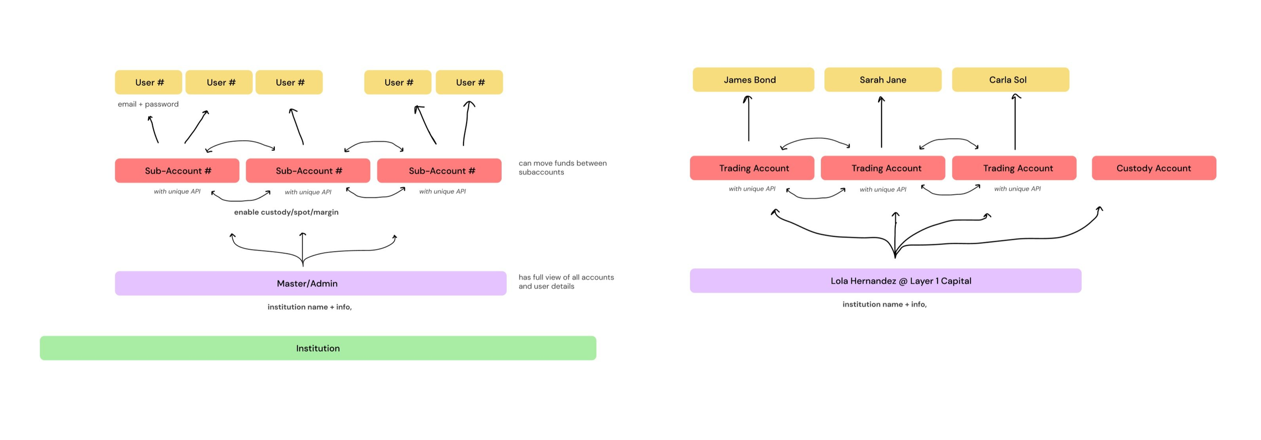
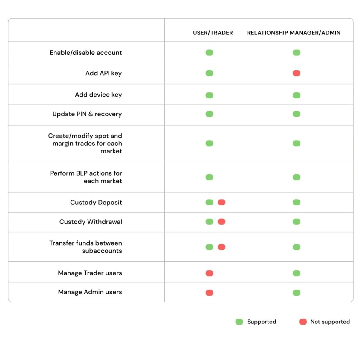
Identifying account permission levels
I couldn’t move forward with the ideal designs due to our delivery timeline.
Designs needed to be shipped as fast as possible. I gained buy-in from our leaders to test a design direction we can confidently launch in the allocated time.
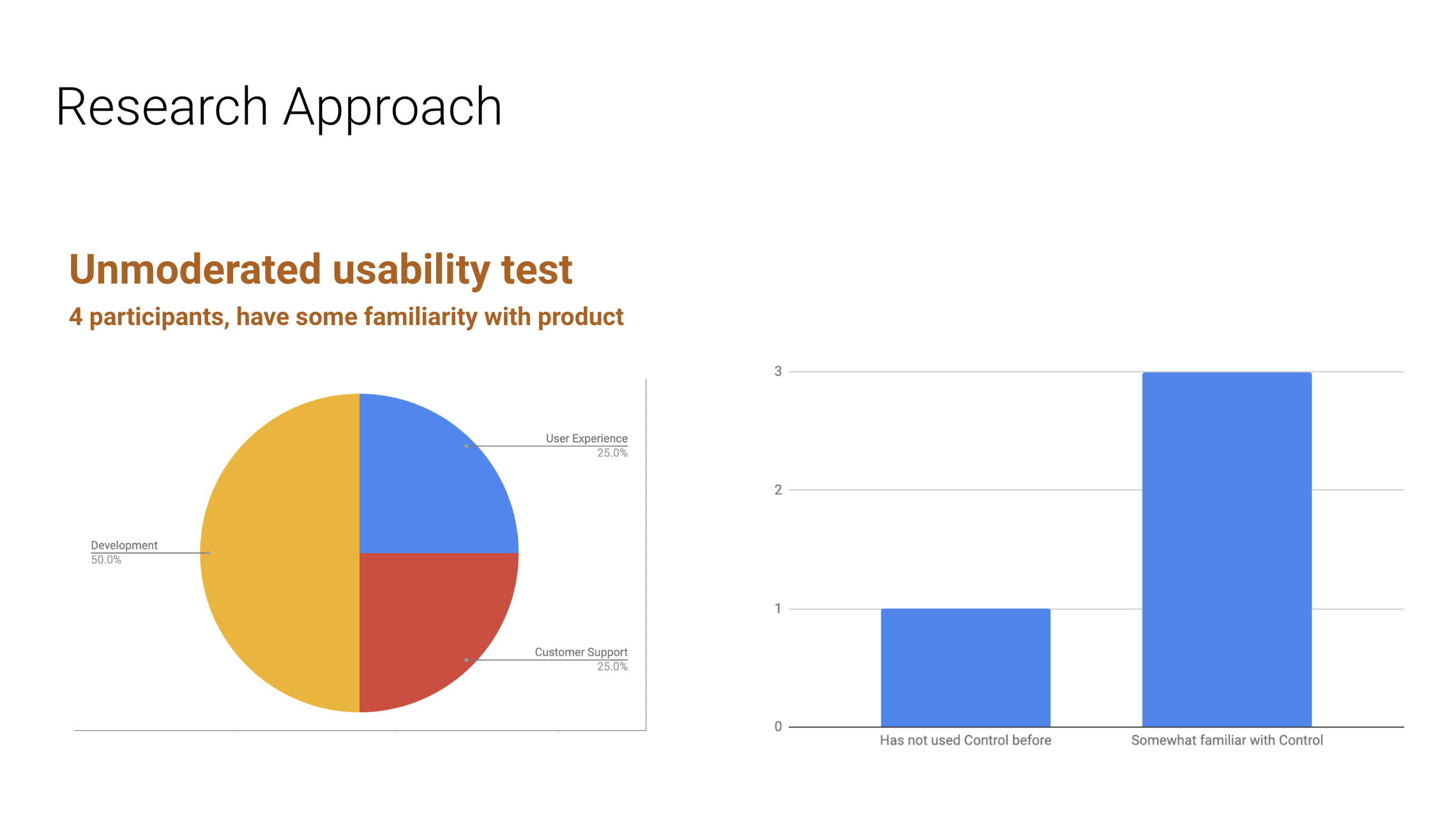
Quickly, I set up and delivered unmoderated UserZoom tests of the two directions. I needed to be confident that there weren’t any alarming pain points.
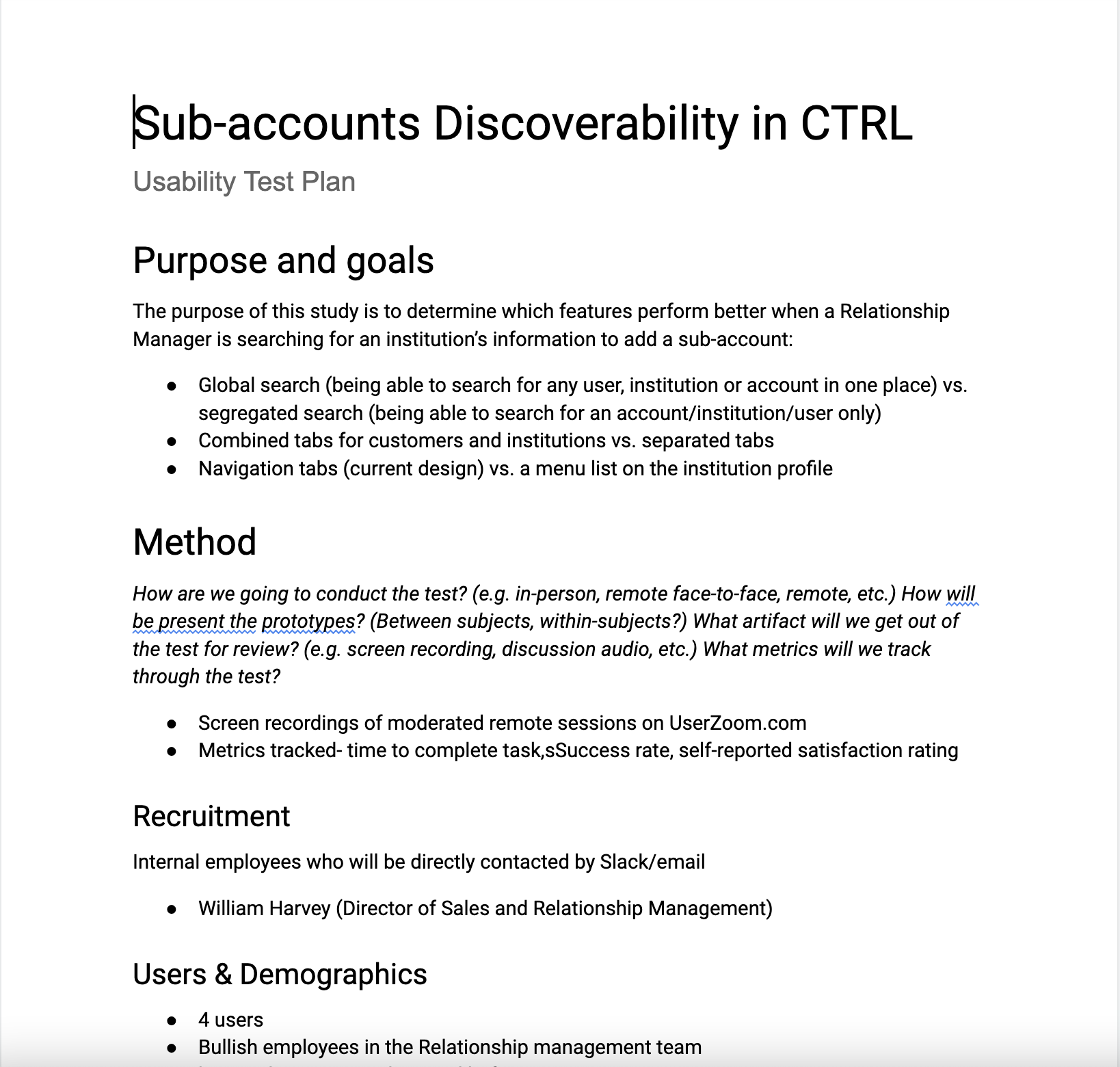
Version A (higher cost)
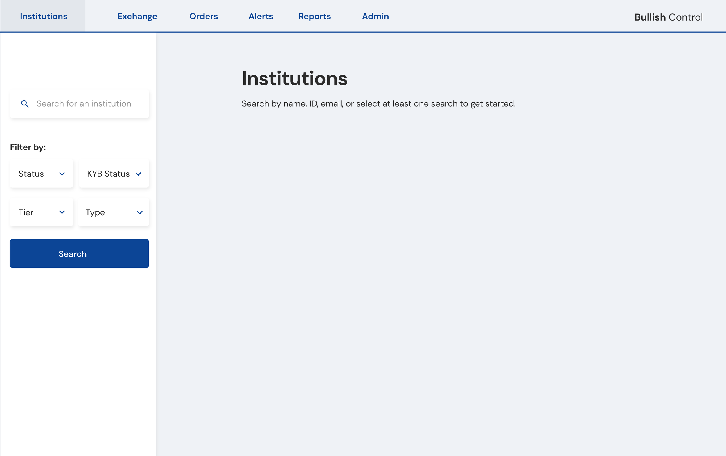
Global Search - Be able to search for any user, account name, or institution name from one place
Combined Navigation/tabs
Version B (lower cost)
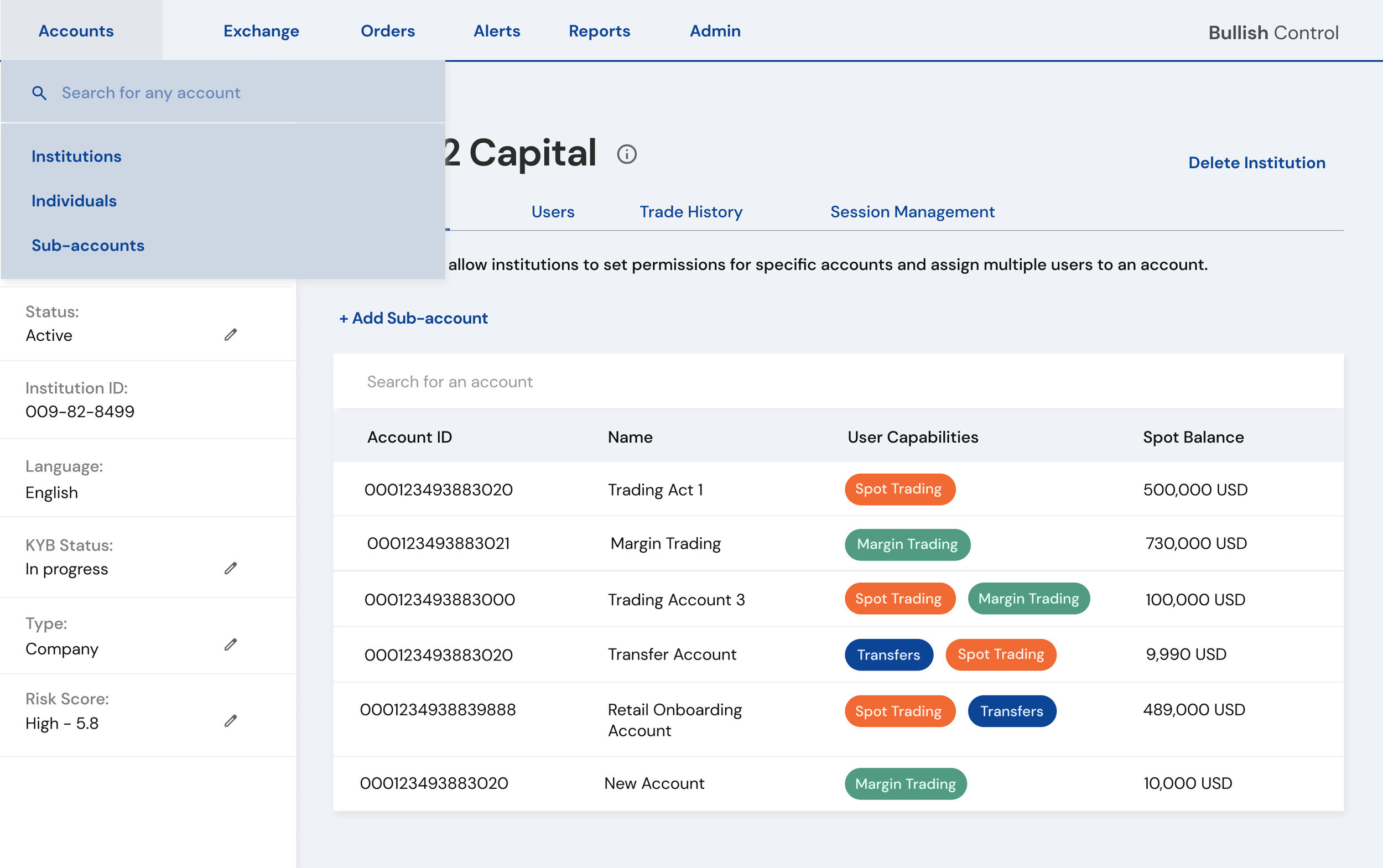
Segregated Search - Be able to search for an institution only. Keep separate search bars for institutions, users, and accounts.
Separated navigation tabs (current experience)
Rainbow spreadsheets are my favorite way to analyze qualitative user data. 🌈
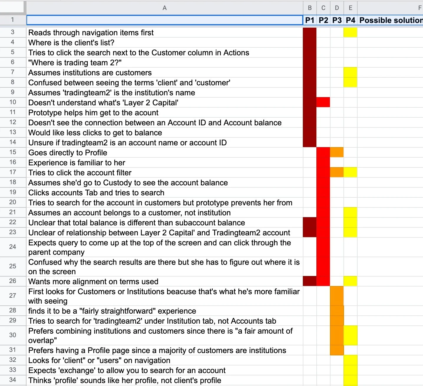
Usability Test Findings
-
1/2 of users needed clarification on the terms ‘institutions’, ‘users’, and ‘customers. “Aren’t institutions customers?” “Can all users be customers?”
-
3 of the 4 participants struggled to make a connection between the “parent’ and “child” relationship of n institution and it’s sub-accounts. When asked to find the sub-accounts balance, they provided the institution’s balance, thinking they’re the same.
-
3 of the 4 participants tried to interact with the filters to complete their search result of the finding a sub-account. This may suggest that users prefer having the option to narrow their results, especially because Control is a data-heavy product.
Final Test Results
40% decrease in time to onboard and create a new institution account in Control
2x increase in Bullish customers trader accounts per company
*Onboarded within 6 months post-launch
Moving forward
Encourage consistency between the organization’s language and terminology used in Control, such as “Institutions’ and ‘Retail Customers’ .
Provide clear labels and/or visual indicators that better define how multiple accounts are inked to an institution. Provide greater emphasis between the institution’s overview and the rest of the content.
Continue providing opportunities for Control users to narrow and define their search results in order to find what they’re looking for quickly and more efficiently.